One of the themes I am constantly exploring (and trying to capture) is that of minimalism and simplicity. To elaborate, crafting a photograph of a person or scene to most simplistic composition available that still maintains the singular important essence of what you are trying to express. This doesn't necessarily mean stripping all complexity out of a scene, as long as they contain or reinforce the story (Martin Parr is particularly good at this).
Like all such objectives, it isn't easy. A recent trip to the coast of North Wales gave me multiple opportunities to attempt to capture these themes.
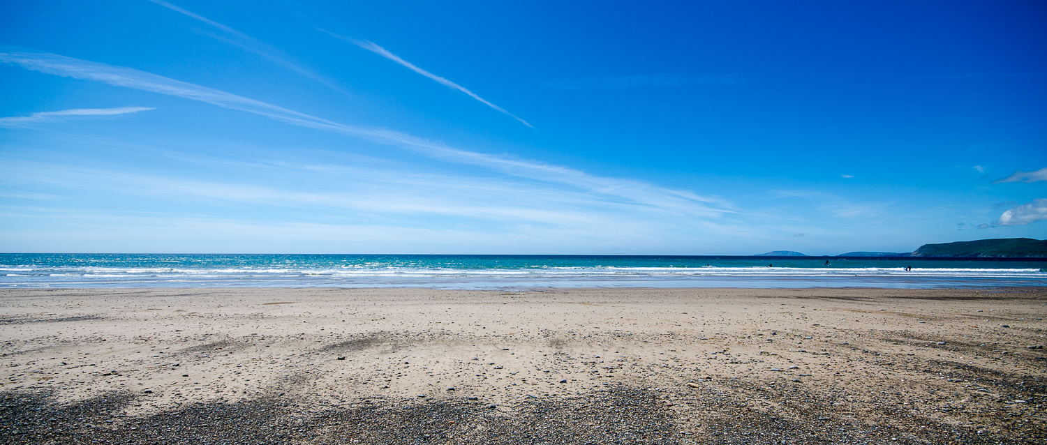
I am particularly interested in the idea of space (and not simply because my 10-20 lens is one of my absolute favourites) and distance, layering simple compositional elements to accentuate the image and the theme. In the case above I intentionally shot to crop to a cinematic 1:2.35 aspect ratio, breaking the image into three distinct but complementary elements - the beach, transitioning from stone to sand, the thin strip of sea and the deep blue of the sky with contrails adding a measure of geometry. In the distance stand several figures, adding scale.

Beach at Aberafon Campsite
The above shot is representative of about a hundred such shots that I took over the week, exploring the placement of the above two wooden supports in the scene. Here I have kept it is as simple as possible, taken at dusk to allow a slightly longer exposure, softening the already calm sea to offset the hardness of the wooden supports and to reflect the cloudy sky. This is a tighter more focussed image, breaking the compositional elements to three.

Beach at Aberafon Campsite
This is another exploration of the area around the two supports. The evening was truly gorgeous, and this scene, in a number of variations, lasted throughout the evening. Again shot to be cropped to the 1:2.35 aspect ratio, there is the added interest of the family in the lower right, their silhouettes leading to the shadow of the wave between the wooden supports and onwards to the area of bright reflection mid-image.
I shoot in RAW, to allow for the capture of the most detail as possible, and for the most control at the editing/production phase. The above image had minimal editing (cropping, minor exposure and contrast tweaks and sharpening), and, as ever, does not do the scene justice.

Lighthouse at South Stacks
My final image for this post is of the lighthouse at South Stacks (a rather painful descent and ascent but utterly worth it). I am a complete fan of the square format - I used to shoot occasionally on 6x6 film on an old Yashica TLR (which I still have) and Mamiya MF camera. I think the constraint of the format forces compositional creativity, and allows for more risk-taking with more success. In general I was not happy with the images I took of the lighthouse, the image above the only one to stand out, particularly in the 1:1 aspect ratio, and especially in the slightly 'heavy' black and white that I prefer.
In this image I have used the path to point towards the white lines of the walls leading to the white lighthouse tower at the slightly offset to centre of the image. There is a narrowing of the image to this point, with the quiet of the sky balancing out the busy heaviness of the lead-in elements, each emphasising the lighthouse as the subject, solitary in its environment, rooted to the land but surrounded by the sea.